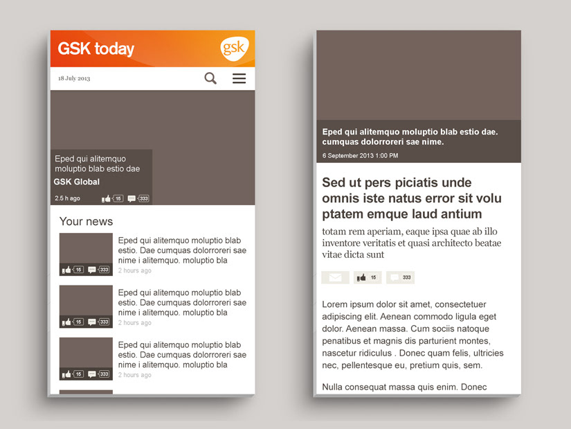
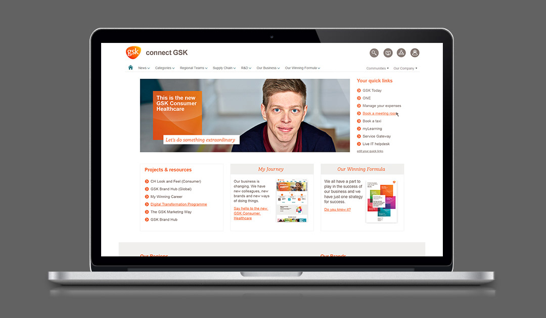
The GSK intranet home page was designed to follow GSK's brand guidelines and tone of voice. The goal was to increase engagement and clarify navigation.
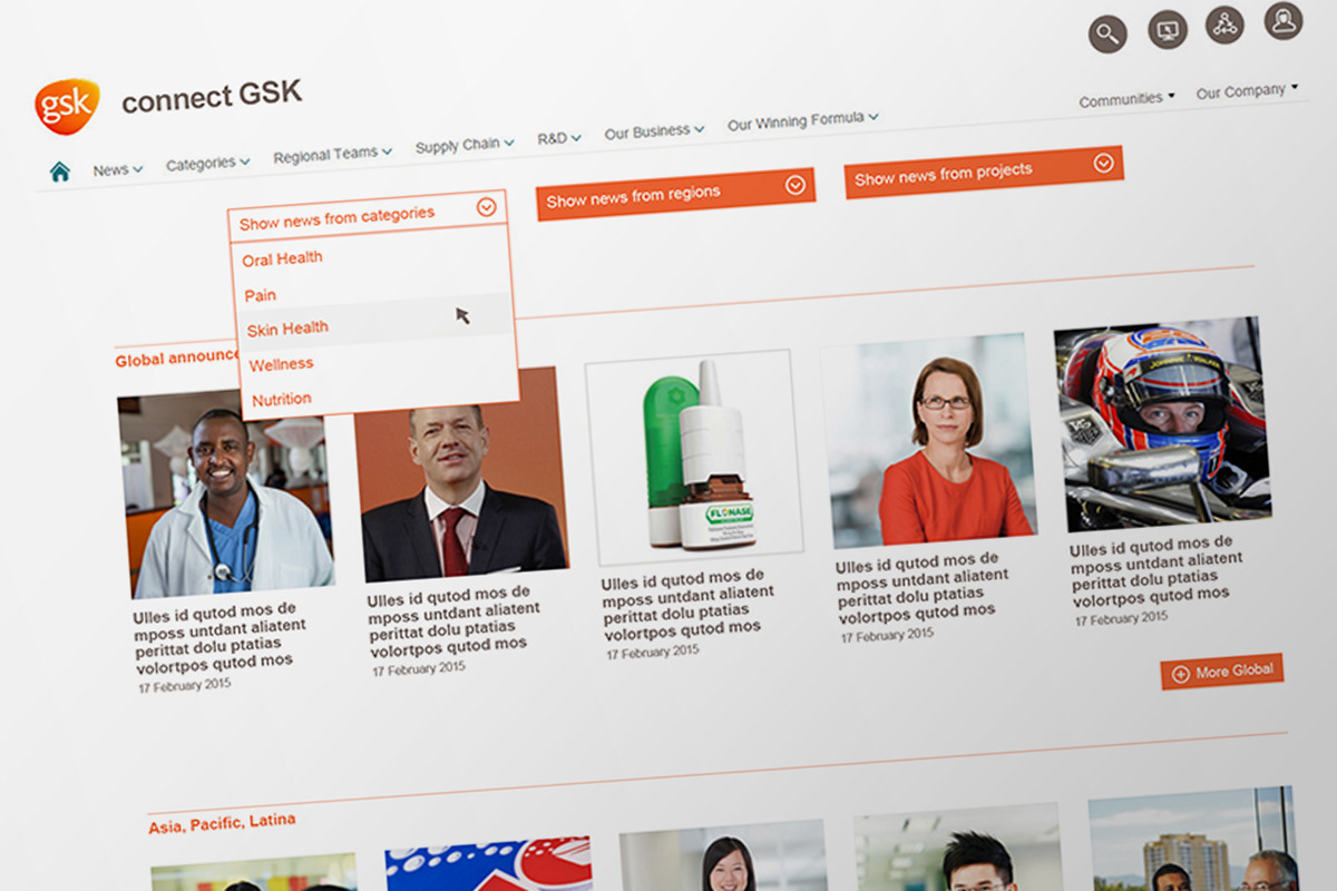
Navigation and filter of newsfeed was simplified, and enabled each user to find stories related to their market and interest area..
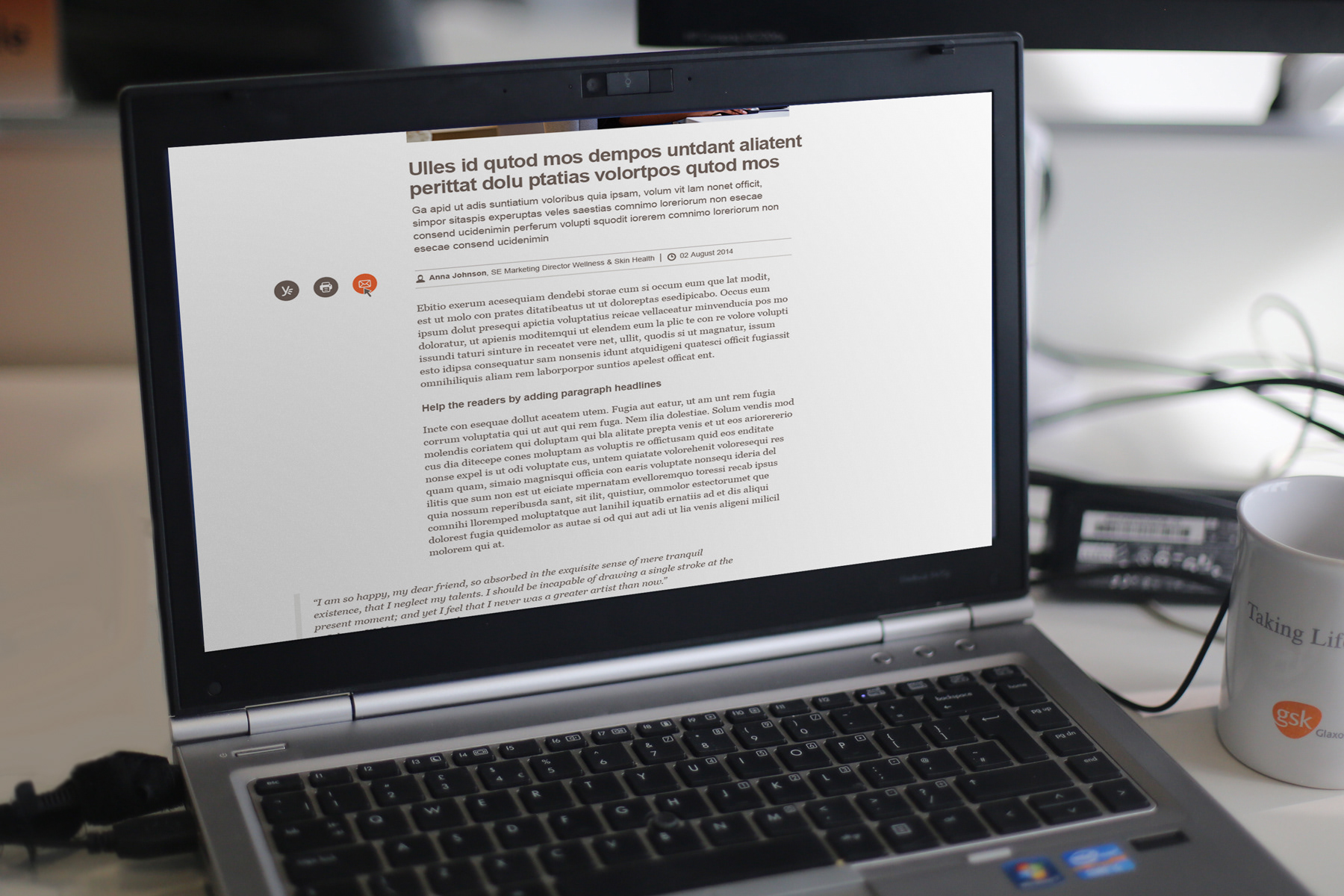
The article page was designed so that each author could add lead paragraph, pull-out quotes and paragraph headlines. This breaks up the wall of text and makes content more digestible.
Margins were added to limit line length and a serif body text was set in larger size, to increase legibility.
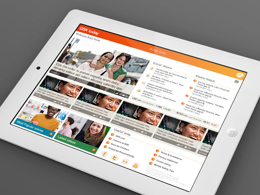
Design of GSK's news site for employees, that could be accessed outside of the intranet, on tablet and phone.
The design allowed for more photos to be used to give a lighter feel.