For my final project I presented a bus application whose aim was to help choosing the bus as a travel option a little easier for potential travelers.
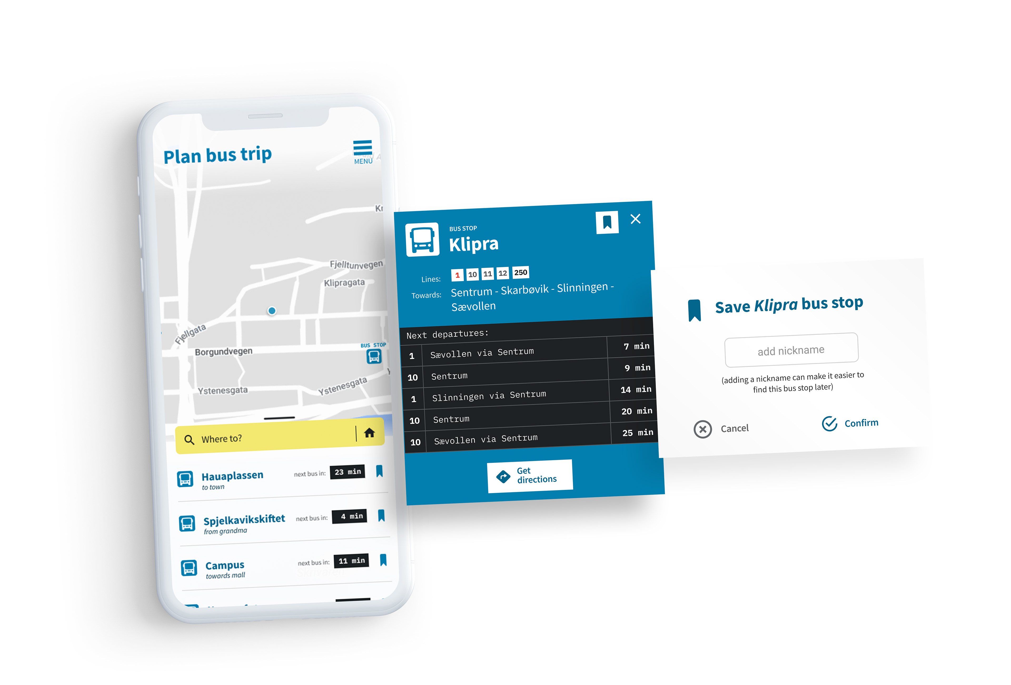
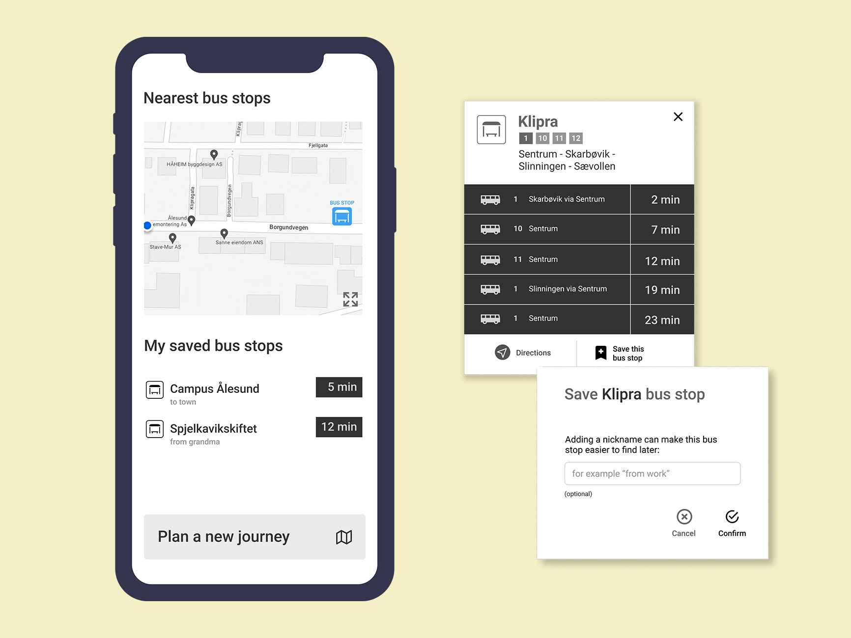
Final designs of bus transportation app.
Case study
The town of Ålesund, Norway has an aim of increasing bus travel in order to reduce congestion on the roads.
For this project, an opportunity was found to help make the local bus a more tempting option for those who do not use it regularly.
Can an app help reducing the hurdle for these potential bus travelers?
(This case study was also published on Medium, with a small review of the UX Nano-Degree at Udacity.)
Research and analysis
For the target audience I decided to focus on the fence-sitters for the most impact. I screened out interview candidates that already take the bus regularly to school or work. I also screened out those who felt like for them, taking the bus is out of the question, for various reasons.
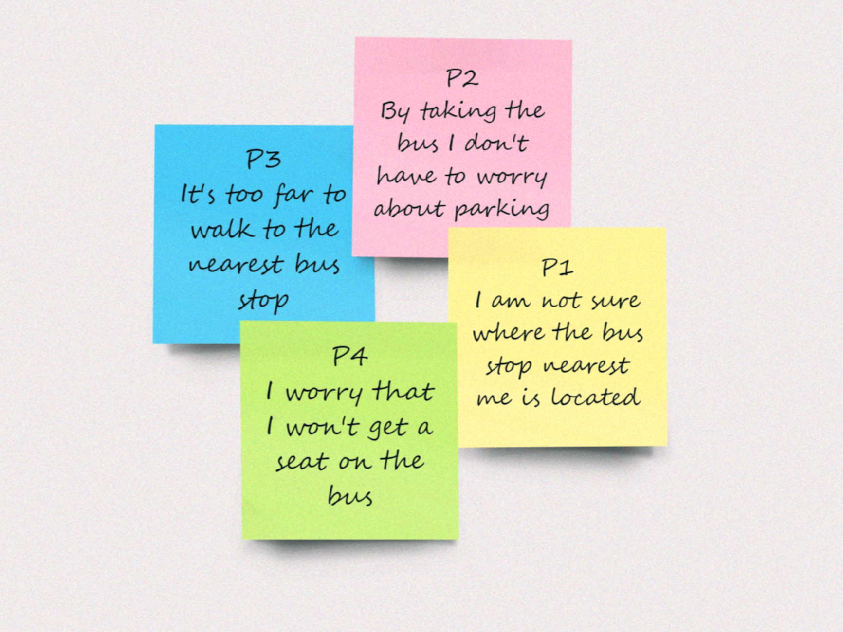
I conducted in-person interviews with four people, who do not take the bus often but who is open to the idea.
I wanted to try to get the interviewees to remember situations in the past where taking the bus has crossed their minds, but they ultimately decided against it. I wanted to investigate what thoughts were going through their minds that weighed positive for taking the bus and the ones that held them back. The interviews became interesting and engaging for both me and the subject as the topic of taking the bus encompasses many aspects of our lives such as money, family, lifestyle, etc.
I created an affinity diagram in Miro with the notes from the interviews, in order to identify different opportunities and angles for the topic.
Whenever the users had any uncertainty regarding the distance to the bus stop and when and how often the buses were going, they were highly likely to choose other travel options than the bus. I decided to focus on this for the next stage of ideating.
Ideating
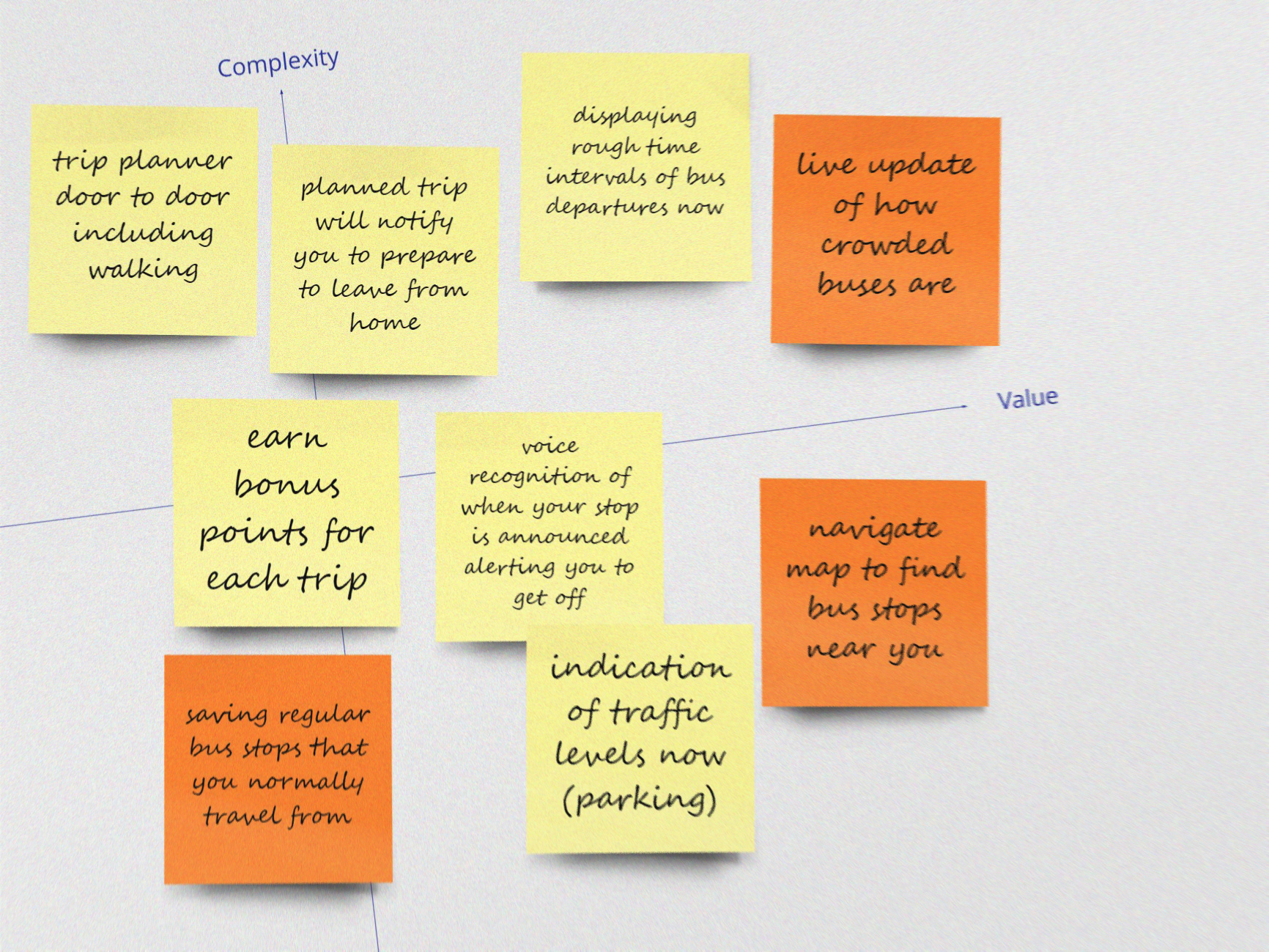
Ideas were evaluated and plotted in a Complexity and Value graph to help decide which feature to include in the prototype designs.
How complex will the feature be to implement, and how much value do the feature give the user?
Sketching
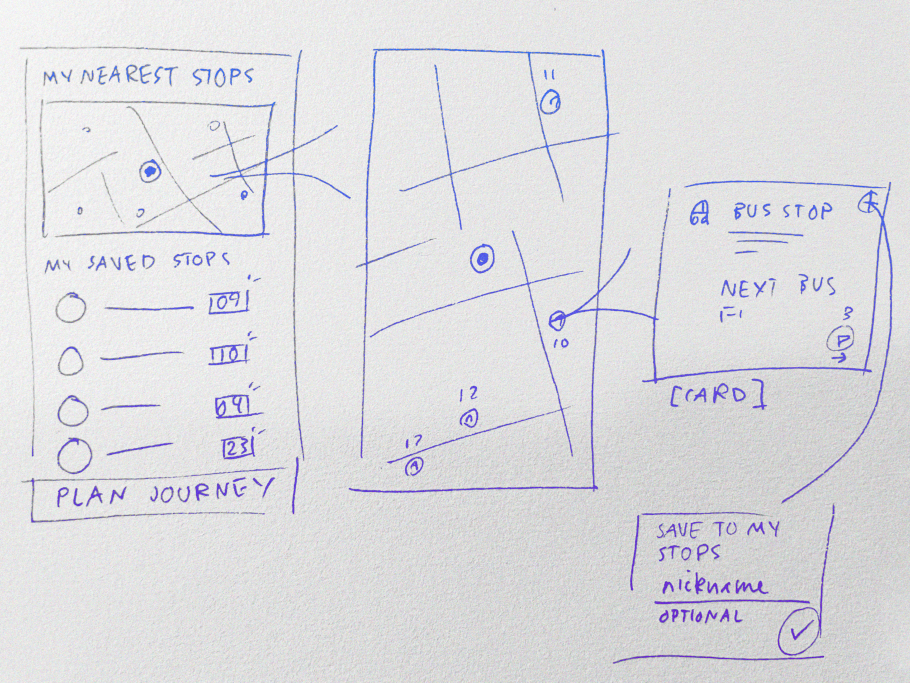
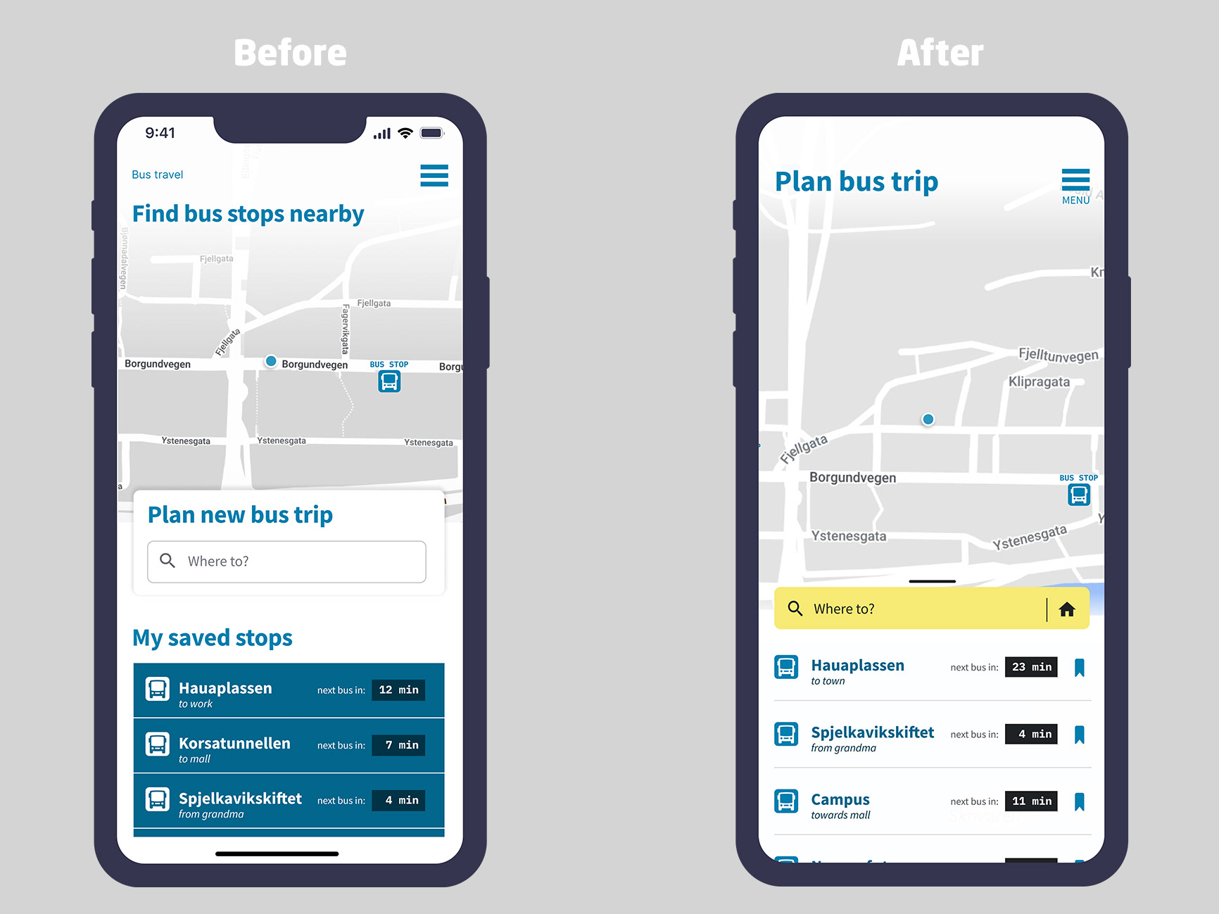
I sketched solutions for a home screen where the users can quickly access information as to when and where their bus goes, trying to remove as much uncertainty (as identified above) as I could in the most straight-forward way possible.
The home screen contains a map with a blip showing your current location and allows user to find bus stops nearby. The “Saved stops” sections show live update about the next bus passing by from your most used stops. There is also a field to start planning a journey from scratch.
Low-fidelity prototype
I created a low-fidelity prototype based on the sketches.
The user can see their location on the map and hold and drag to find bus stops nearby. Clicking on a bus stop opens up an information card displaying all the bus routes and upcoming departures from this stop.
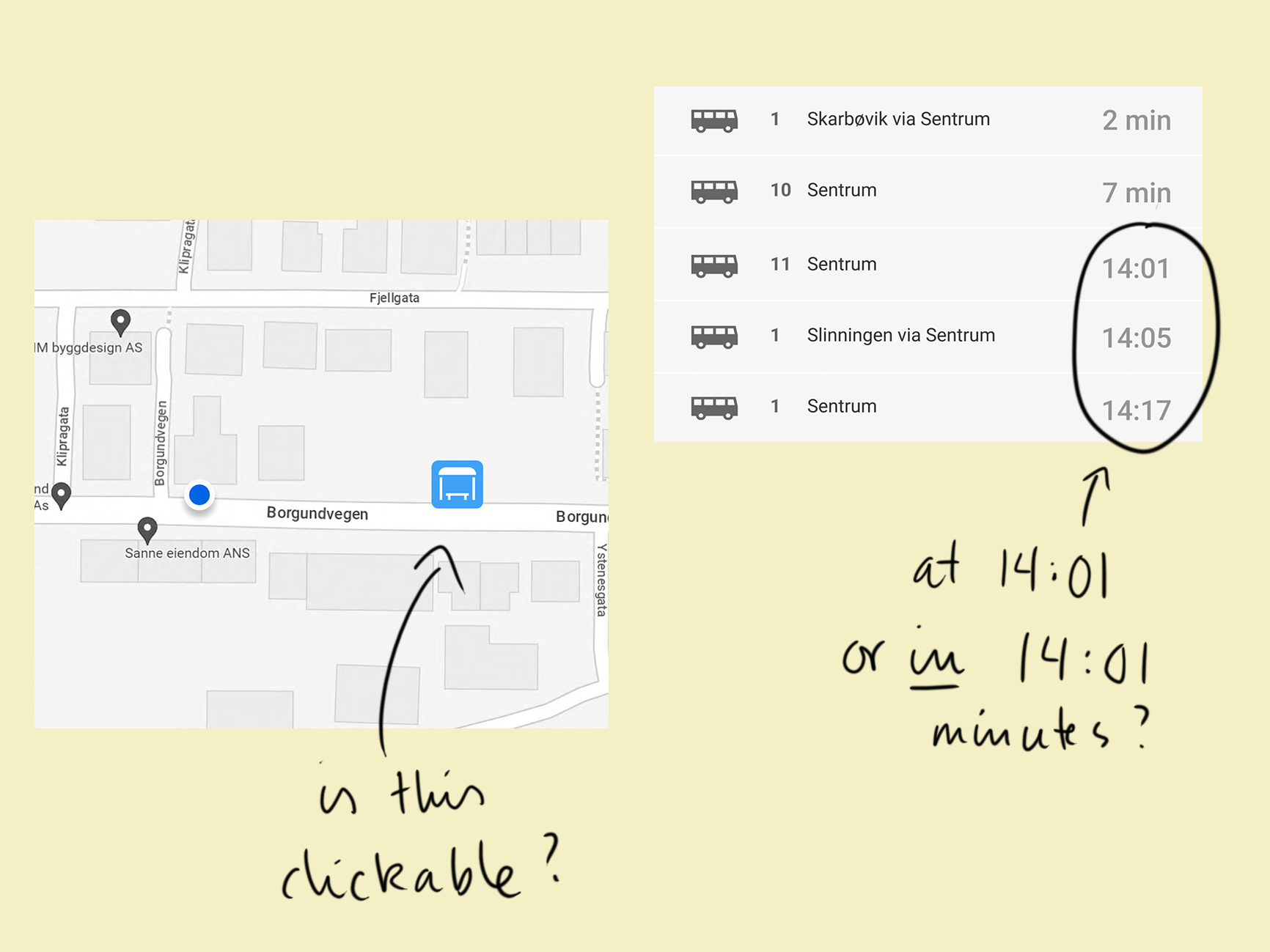
Low-fidelity user test
A user test on this low-fi prototype was done in order to spot issues early on. Areas where the user had questions or seemed confused were addressed in the following design iterations.
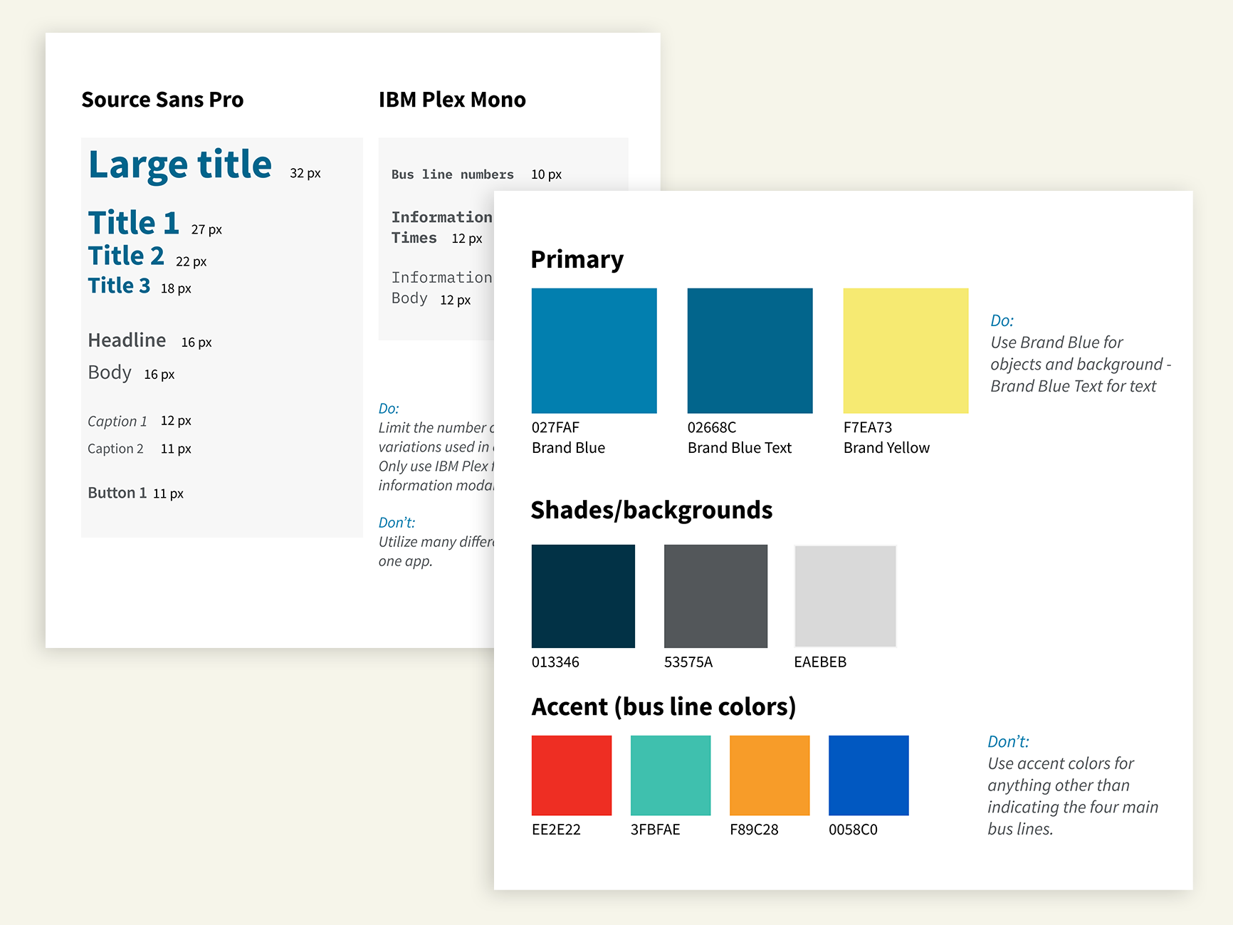
High-fidelity prototype, styleguide and UI kit
I designed a high-fidelity prototype in Figma and also styleguide and UI kit. I used Zeplin as a tool to potentially hand the project over for development.
Usability review
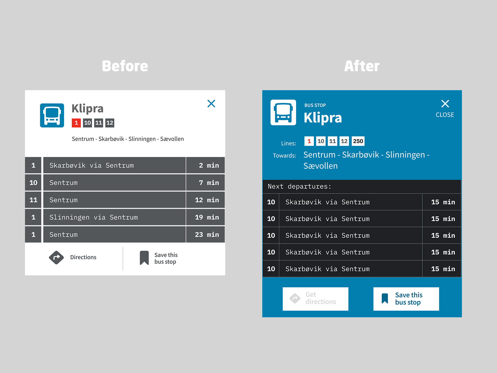
The designs were evaluated where concerns with reachability, legibility, cognition and screen-reader use were addressed in further design iterations.
Cognition and screen-readers:
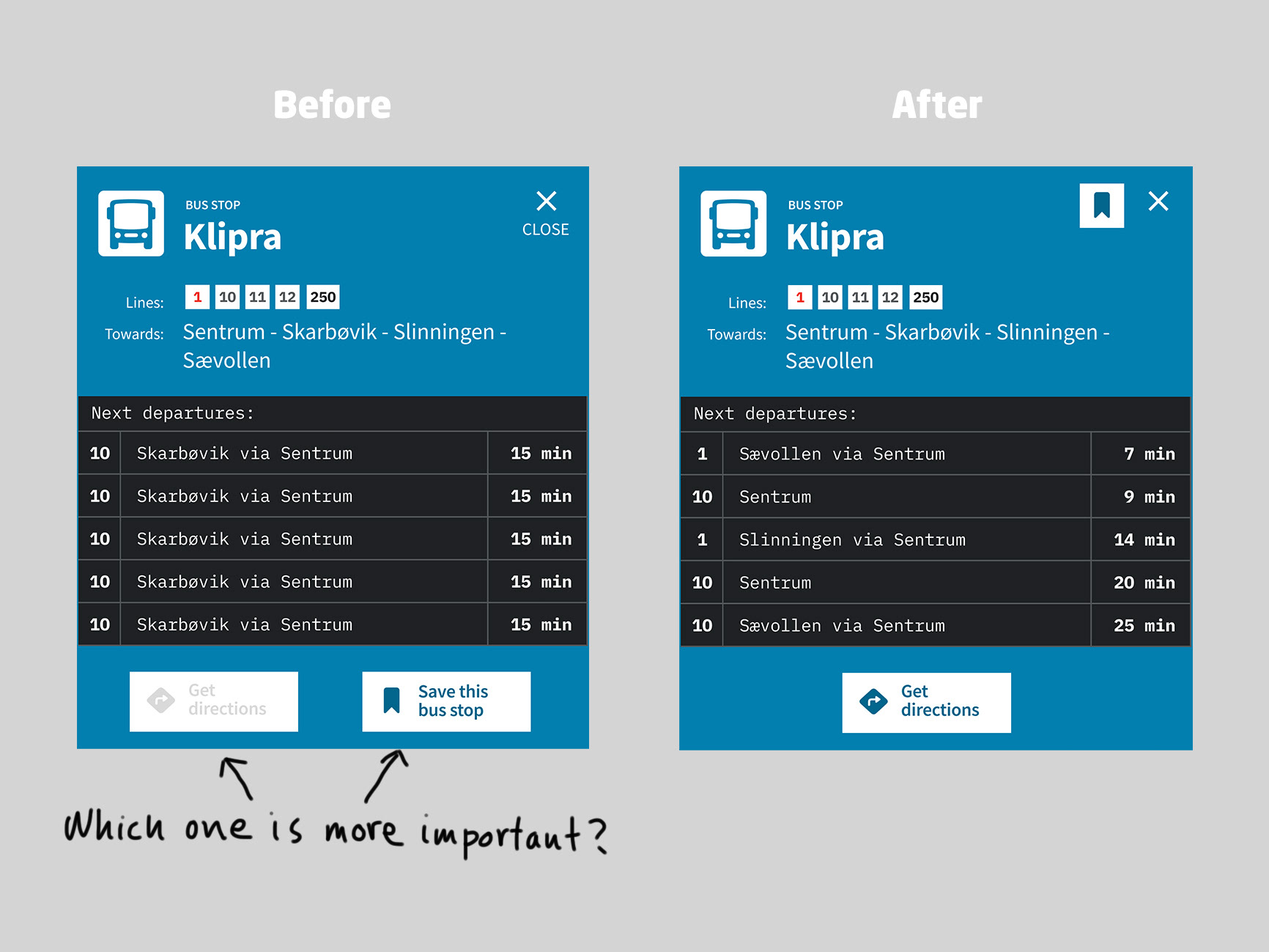
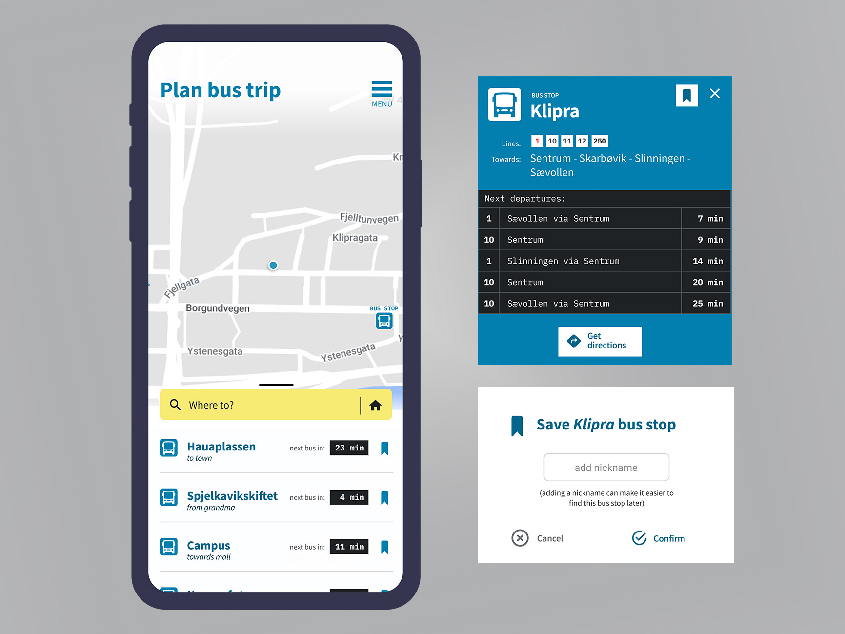
Words were added to bus info card to clarify information, such as “Lines” and “Towards”.
Legibility:
Font sizes were increased as much as possible without causing issues for modules with more text
Reachability (for example when using one hand only):
- The search bar was given a more contrasting colour in order to separate the main elements on the screen with increased hierarchical difference
- A drag handle was added to minimize search bar and saved stops. In this way map is easier to navigate with thumb
- The search bar was moved downwards to be more reachable by thumb
- A “home” feature was added to the search bar to enter home address with one tap
Remote user testing
Remote user testing was done using the Lookback platform.
User tests revealed confusion around the save function. In my view it was distracting the user flow.
Saving the stop for later might not be at the top of the user’s mind when out on the road looking for their nearest bus stop.
Therefore, the save button was moved to a less prominent place on the card. (Top right corner, next to the close button.)
I ran into some issues conducting tests on the Lookback platform. The platform was slow and instructions were confusing for the testers. Another issue was that the test was simpler than the testers expected and this caused doubt and hesitation. There was also confusion when the prototype did not function as a finished app. The user cannot type and search, for example. I will try out another platform next time and see if that works better.
Final designs
The project ended here and no further user testing was done. This is where we would hand in our final project and graduate with our Nano-Degree.
Some thoughts I’m having about the project after it is done is that, it would be interesting to do research in the physical environment. For example, the use of the app would be quite different in different contexts: at home in peace and quiet, on the bus or walking around outside looking for a bus stop.
The actual public transport app for Ålesund was redesigned shortly after I did this project. The app is more user-friendly than before but it still has a lot of buttons and options visible on every screen. In my view this clutters the experience and I believe reducing the amount of buttons and options visible from the homescreen makes the app easier to use. I would love to run some user tests to see if this is true or if it’s just my biased designer’s view…